“I’m OK” is a universal middle-ground of human expression. It’s not great, but it’s not bad either. I chose “OK” as it’s the question that was always asked of me… “are you OK?”.
It’s a baseline.
#weareok
Our wonderful brand, as realised by Caz
We’re in the early stages of the idea and needed suitable stock images to start to build up a picture of who would use the app to give off the right impression.
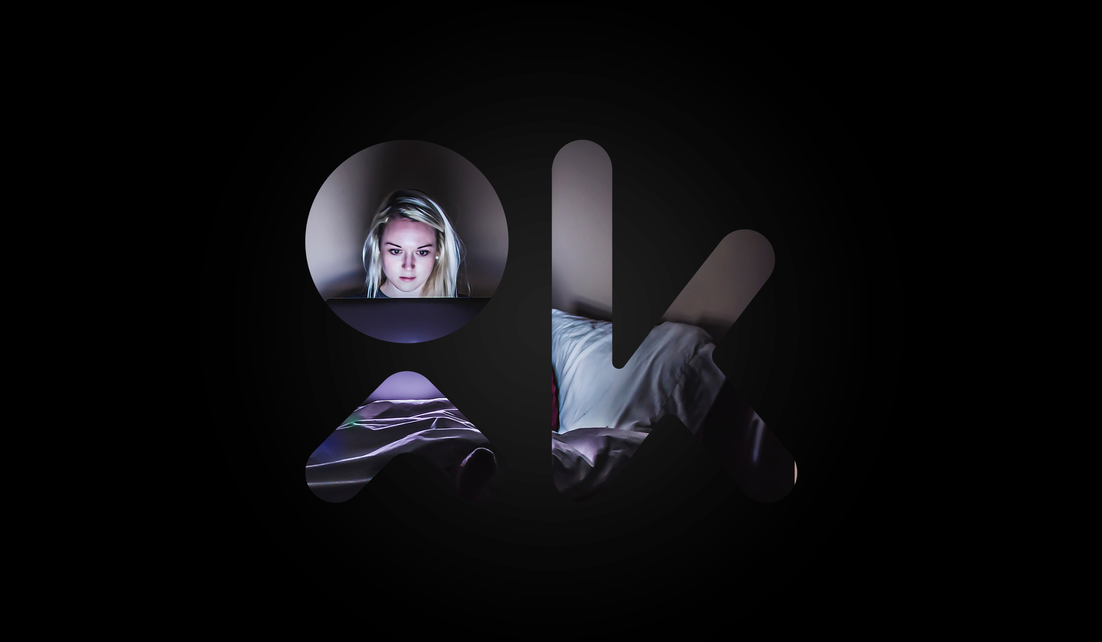
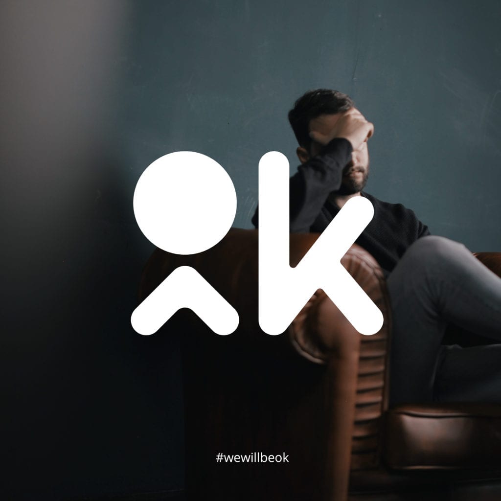
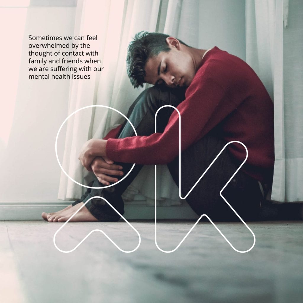
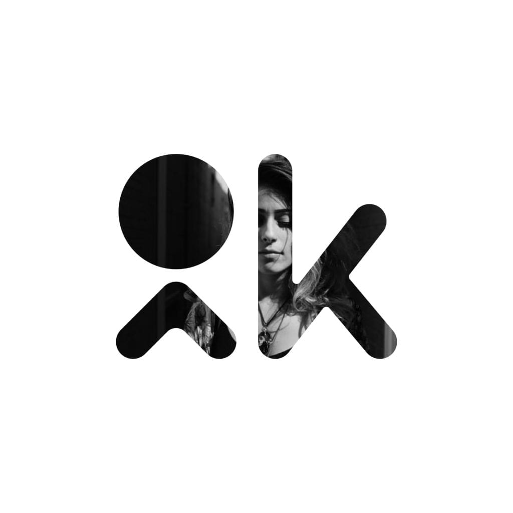
Using unsplash.com, a fantastic resource of free-to-use photography, I sourced sets of images that matched our idea – mixing them with the cutout shape of our logo.
These created a mix of emotional imagery which emphasises the person behind the OK status, and how the app simply helps frame it.
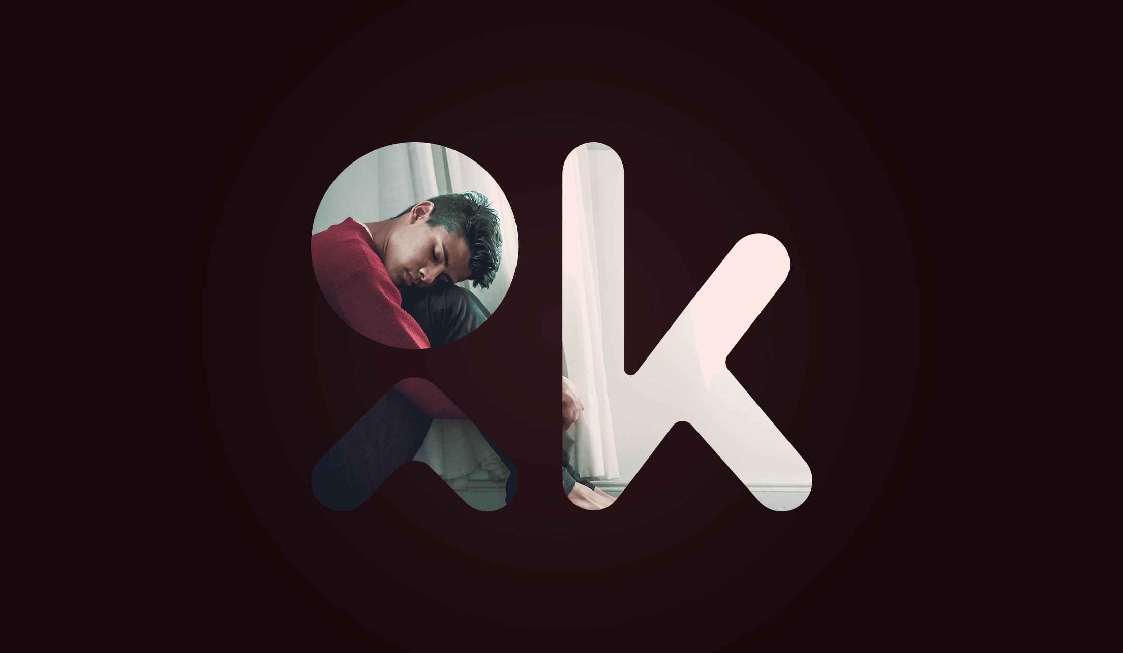
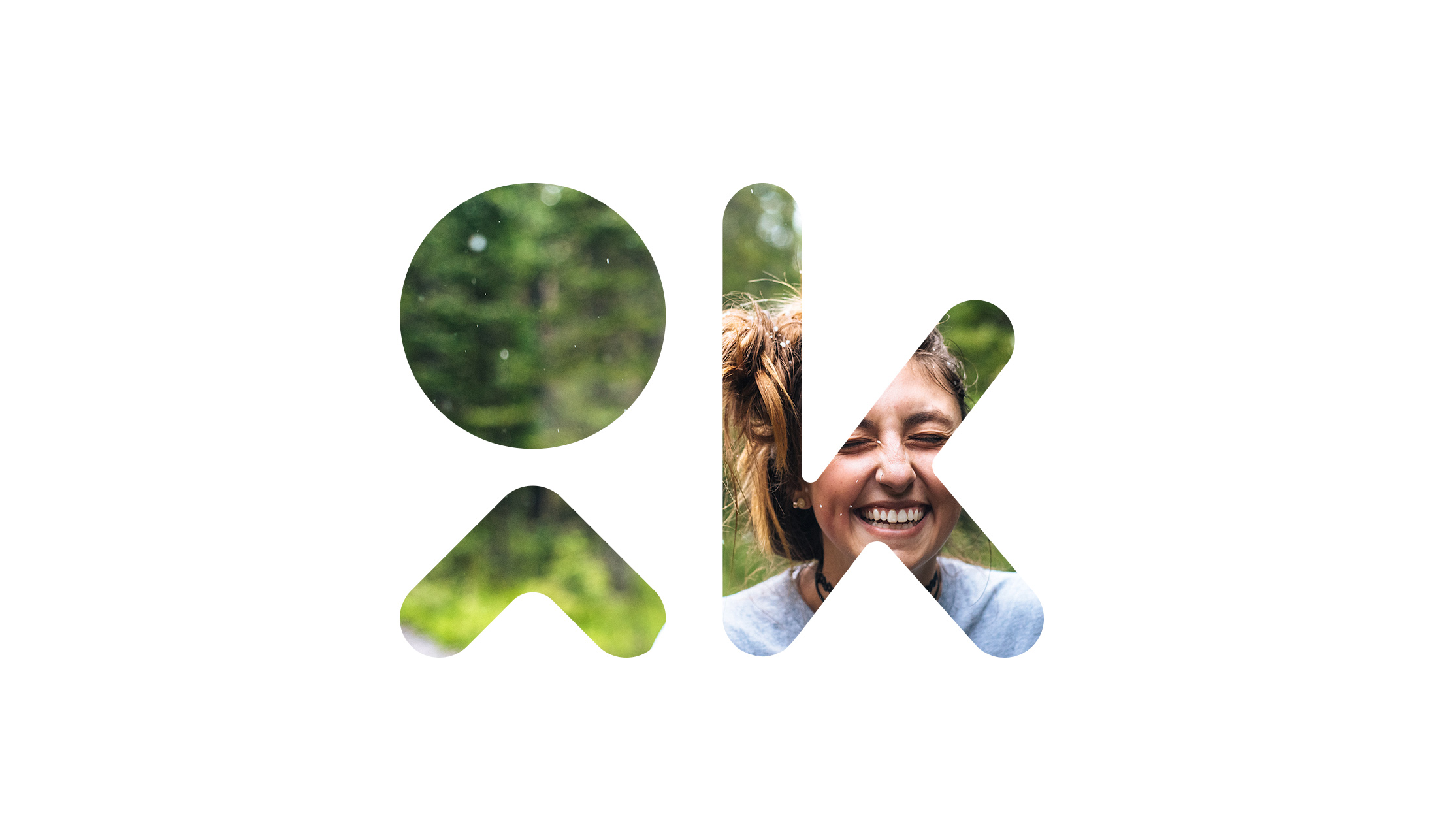
I wanted to show the difference and stark contrast between someone who is OK, and doing well today, and someone who is not as OK right now.
The message is there to highlight that if you are doing well or struggling today that letting a loved one or friend know is the first step to opening up and communicating. Even if it’s the smallest thing you can manage – the OKButton is designed to help with that first step.
Can you help us? 🚀
We're 19% of our way through funding V1.0!
What does it take to get an app out there? Time, effort and money? OKButton is a project of passion, and we need your help to make it happen

